
MIRROR
A fast fashion established retailer expanding its online presence

CLIENT
MIRROR
Role
Lead UX/UI Designer (Research,Interaction Design, Visual Design)
TIMELINE
June 2019 4 weeks
TOOLS
Sketch, Illustrator, InVision, Zeplin
BACKGROUND
Mirror is a successful global clothing store established in 1994, offering a wide range of quality affordable clothing for a variety of customers.So far, it has a strong brick & mortar store presence but hasn’t capitalized the mainstream e-commerce market, which in turn has begun to impact its revenue adversely. This combined with their loyal customers feedback has forced them to rethink their strategy and embark on a digital transformation.
CHALLENGE
Redesign MIRROR’s website to make it responsive
Provide an intuitive and rewarding interactive customer experience
Rebrand it as a modern and neutral company for all ages, which included a new logo design for Mirror

GOAL
Understand the current trends in the clothing industry
MARKET RESEARCH AND COMPETITIVE ANALYSIS
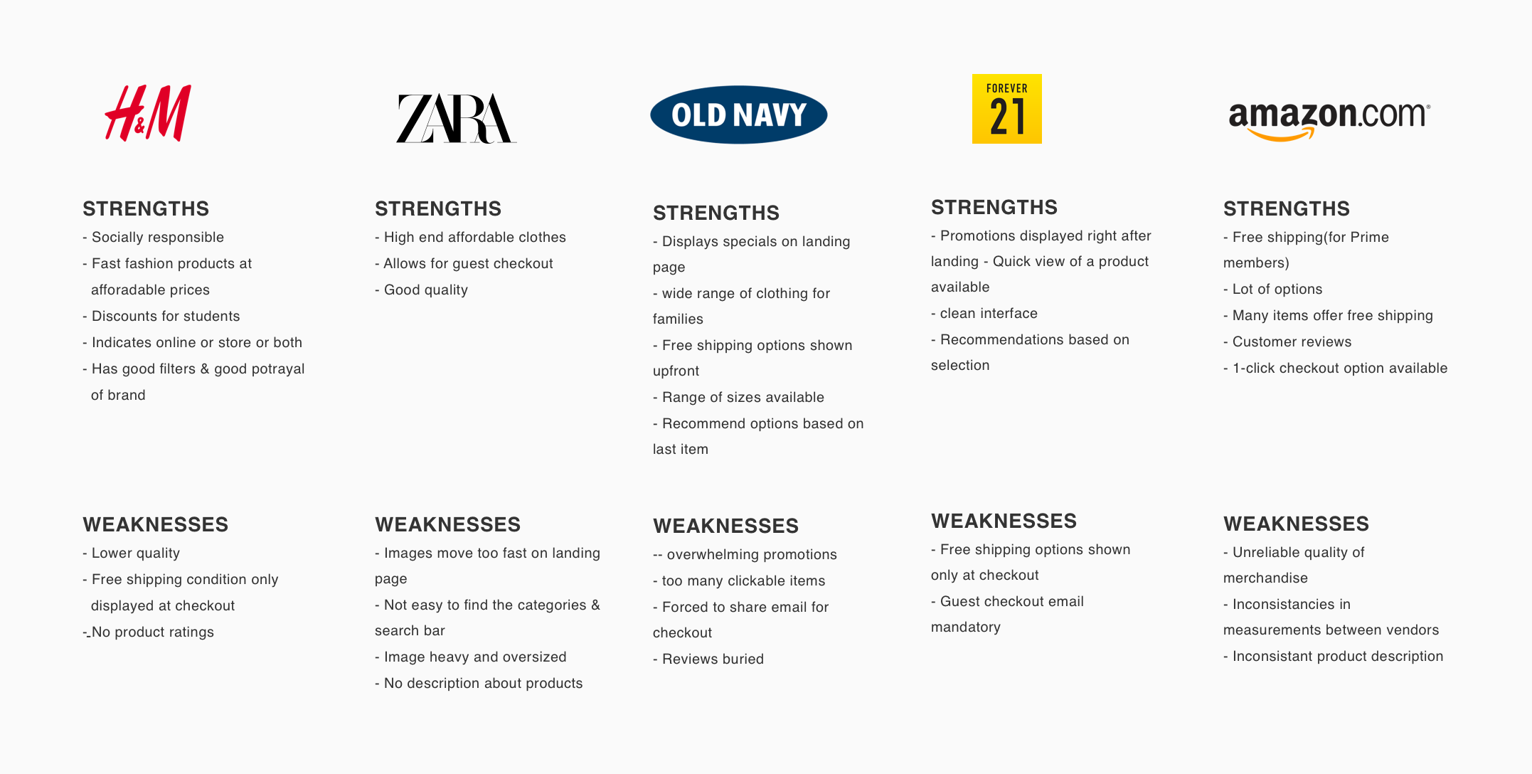
In order to position the Company properly in the e-commerce fashion industry, I first performed a Market Research and Competitive Analysis as my secondary research method to understand the industry and the major competitors. Through market research, I gathered the trends and various statistics and through competitive analysis, I evaluated Mirror’s competitors strengths and weaknesses.
Insights from Market Research
eCommerce clothing segment expected to grow to 455B in 2022 from 363B currently
All generations expect 75+ and above have similar percentages of customer segments
Woman comprise 52% of the online shopper customer base
Other major influential factors that determine are price, Shipping speed & cost, Brand reputation, discounts & variety , flexible returns and Simple site navigation
Important trends for eCommerce users
Clear product images and details - 87.6%
Referrals from users with good social media experience - 71%
Easy checkout with guest checkout option - 38%
Fast response time - 60%
Competitive Analysis
USER INTERVIEWS
No.of Participants : 6
Gender : 5 female, 1 male
Age range : 21
I then conducted some user interviews as my primary research method to establish empathy by asking open-ended question in order to discover the users key needs, desires, frustrations and overall shopping behaviors

GOAL
To identify the target user and their needs, goals and frustrations and define the problem to be solved
EMPATHY MAP
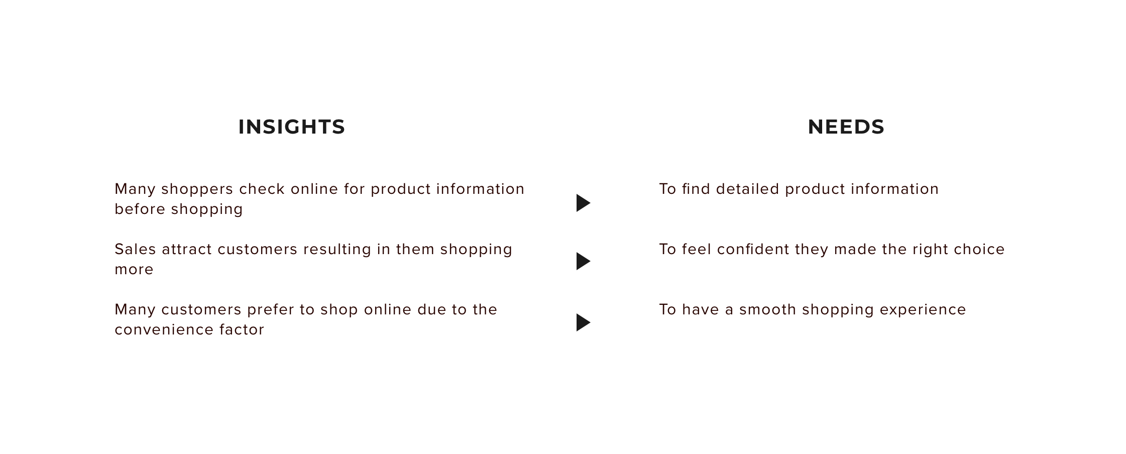
From my user interview findings, I created an Empathy map to visually organize my findings. This helped me to find the trends and patterns, from which I derived the insights and needs
USER PERSONA
From my research findings and empathy map, I created a fictional user persona representing the characteristics/behaviour of the key users that will help me design relevant solutions
STORYBOARD
Based on gathered research, I drafted a short storyboard illustrating the persona’s online shopping experience. This quickly communicates a perceived user problem and how Mirror’s website can pose as the solution to this problem.

GOAL
To brainstorm ideas to solve the problem identified and derive the information architecture of the site
FEATURE ROADMAP
In order to ensure Mirror’s goals are also taken into consideration and the technical constraints that exist are accounted for, I listed the individual goals of the user, Mirror and the technical goals. From this, I extracted the common goals among all 3. and used them to identify the features that need to be given prioritization. The priority also depended on ease of development and popularity.
View the full feature roadmap here
SITEMAP
I conducted an open card sorting exercise with 4 participants using 50 different category items commonly found on clothing store websites. I used the observations to come up with the sitemap to show the proposed pages and how best the content can be structured for users to navigate a product with ease. These were the findings from the card sorting exercise -
All participants were inclined to go with the structure they were familiar with on other clothing websites
All expect a hierarchical structure
Other categorization was by Occasion, gender, size
View the Cardsorting detailed findings here
TASK FLOW
To simulate the path a user will take for accomplishing a particular task of purchasing a clothing including login/signup with ease, I created a task flow diagram. This helped me identify which pages are required for this process.
USER FLOW
Taking my persona and project goals as the basis, I developed detailed user flows for 2 different scenarios that tell a story about their journey through the site.
GOAL
To determine the interaction architecture of the site by creating wireframes and prototypes, design the UI and branding
SKETCHES
Before moving into digitally sketching wireframes, I began with some hand-sketched concepts for the Mirror home page. This gave me an opportunity to brainstorm different approaches with minimal effort and think through which direction might best meet the needs and wants of my persona, as well as meeting Mirror's priorities and business goals.
MID FIDELITY WIREFRAME
In order to build on and test early prior to adding the UI details, I created the mid level fidelity wireframes to identify if the flow was logical, if any elements need to be added to provide a meaningful and complete experience or to remove any which were a distraction. These served as the blueprint for Mirror and helped me focus on the visual hierarchy and interactions within the site before the UI elements.
BRAND STYLE TILE
As part of the UI design, I put together a style tile representing the typefaces, button styles, imagery, color palette, and logo examples for the brand to have a reference guide when designing the site and ensuring a consistent look. I chose these UI elements that represents its key adjectives of how it wants to be represented namely - modern, reliable, fashionable and affordable company.
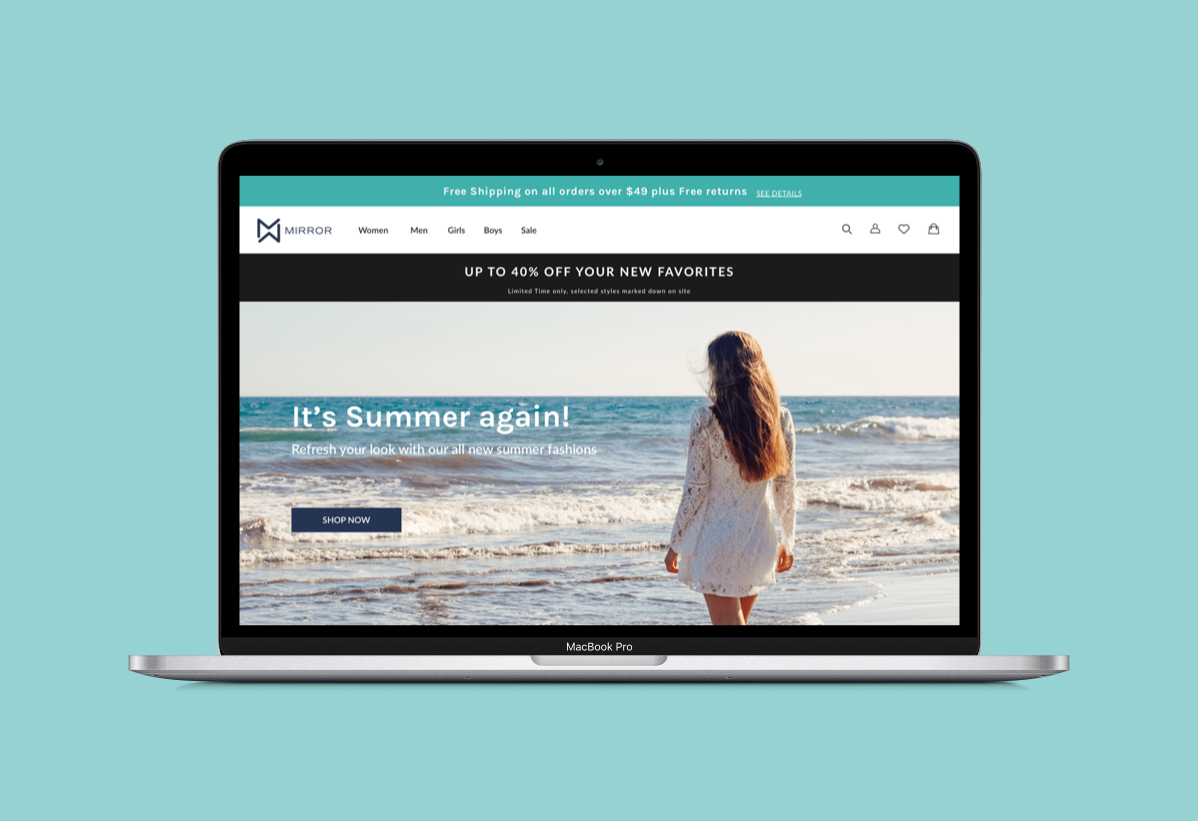
HIGH FIDELITY UI WIREFRAMES
Taking the wireframes created for the user flow, I added the content and visual styling and created the high fidelity mock-up for use in testing. I also created High Fidelity responsive wireframes to establish the brand across different screen sizes and to ensure the UI elements will work in all.

GOAL
To conduct usability tests, synthesize results and iterate to make the product more usable
USABILITY TESTING
Method : Hybrid (skype and in-person)
No.of participants - 5
Age group - 20 - 45
Gender - Female
In order to measure the effectiveness/usability of the product design and gather feedback from users to iterate as needed, I created a test plan with the methodologies and specific tasks which I will have the users (selected to match my persona) perform in the test.
Objectives
Determine if the website is intuitive and easy to navigate.First time user should not require any help in navigating through the website and completing the task
Test if User is able to find & purchase the product with ease
Gather user feedback on overall usability, look & feel of the website and determine the areas of improvement based on it
Tasks
Browse through the home page and look up common information like sales, shipping etc
Navigate to the product category page and select a particular product using filters
Make individual selections and add to the shopping bag
Increase quantity and checkout as guest
Complete providing all shipping & payment information and place the order
AFFINITY MAP
I generated the Affinity map to present the synthesized findings of the usability tests in a visual report format, with insights and recommendations that will the team to iterate and improve the product

PRIORITY REVISION
Finally, I fine-tuned the designs and updated them to improve their usability by using insights made from the affinity map
UI KIT
I started putting together a UI kit while prototyping and updated it after the usability tests were done. This kit will contain all the UI elements used and will serve as a reference guide for any future work. I also prepared created the hand-off the deliverables using Zeplin, in case it was to be developed.
REFLECTION
Following existing patterns. During all phases of the design, it became evident that users instinct is to follow a pattern they are they are familiar within the related fashion retail industry. For efficient navigation, they preferred the information architecture to follow the existing labelling and categorization pattern. When these navigation and other design patterns like breadcrumbs, shopping cart etc were based on already established patterns, it eliminated/reduced confusion for the user and aided them in finding what they want soon.
Research. I felt the most important part of this design was the beginning - the research - learning as much as I could about the successful market trends and users. The knowledge gained from initial research helped in deriving the persona’s goals which drove many of the design decisions.
Usability testing. One important research findings about displaying sale information wasn’t translated well in my final design and that became very evident during usability testing. This reinforced the need of usability testing to identify issues at early stages and also the importance of research findings.
NEXT STEPS
With the priority revisions done, complete another round of testing and iterate as required.
I’d like to design few more screens to have some more functional features taking it a step closer to having a complete website