

SPOTIFY
OVERVIEW
Spotify has steadily enhanced its digital music platform and matured into a major service since its launch in 2008. As a leader in the music streaming app industry, it wants to further strengthen its connection by improving user’s engagement and retention in the app.
Role: User Research | UX Design | Social | iOS
Timeline: 4 weeks
Tools: Sketch, Illustrator, Invision
Team: Anita (Self), Alan Hurt (Design mentor), Other UX Designers (Group crits), Stephanie (Graphic Designer)
CHALLENGE
To design new engaging social features for Spotify’s users
To integrate the new features in a seamless manner into the existing app
SOLUTION

Privacy was a primary driving factor that determined whom to engage with on the Spotify platform. The new features introduced allow users to follow and discover music within their friend circle, thereby making it a reliable channel. The solution also included an indirect feature of saving and sharing user’s listening history.
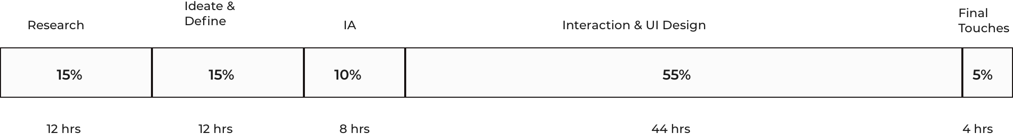
EFFORT DISTRIBUTION
RESEARCH
GOALS
To help me channelize my efforts, I created a research plan listing my goals for the research phase, the assumptions I had and the type of questions I need to ask to find information to solve this problem. The full plan can be viewed here
My main research goals were -
To gain insights into Spotify users’ behaviors, frustrations and needs
To identify & evaluate the competition in the music streaming app industry
To understand Spotify user demographics
MARKET RESEARCH AND COMPETITIVE ANALYSIS
In order to address my research questions and gain meaningful insights to help me channelize my efforts, I combed through the various articles, statistics, blogs, reports etc that I found online and nitpicked the relevant information. Considering the majority of users are smartphone users, I decided to develop the new features on the Spotify mobile app.
Market Research
Competitive Analysis
In order to understand how Spotify differentiates itself from the numerous other music streaming apps in the market today, I did competitive analysis and tabled my findings. Spotify seems to be dominating the market today and apart from offering free service, I noticed their social features allowing users to connect to others are better than the rest.
HEURISTIC EVALUATION
In order to get a better idea of the existing Spotify’s user interface and the design patterns it uses, I conducted an app audit by referencing Nielson’s usability principals. Following this exercise, I had a better sense of how I should integrate the new features for them to seamless.
USER INTERVIEWS
On interviewing real random Spotify Premium users by asking open-ended questions, I got better insights into their behavior and experiences with the app, including their expectations around music streaming apps.
No.of Participants : 5
Gender : Male & Female
Age range : 25-40
DEFINE
EMPATHY MAP
From my user interview findings, I created an Empathy map to visually organize my findings. This helped me to find the trends and patterns, from which I derived the insights and needs. Users seem to rely heavily on the recommendations by Spotify and known friends who are Spotify users to discover new music.
“Discover Weekly is golden and recommends music I like.” - Kristi
“My friends text me links to songs they like or we use the collaborative playlists feature in Spotify. That is cool” - Ian
View the full empathy map here
Patterns & Trends
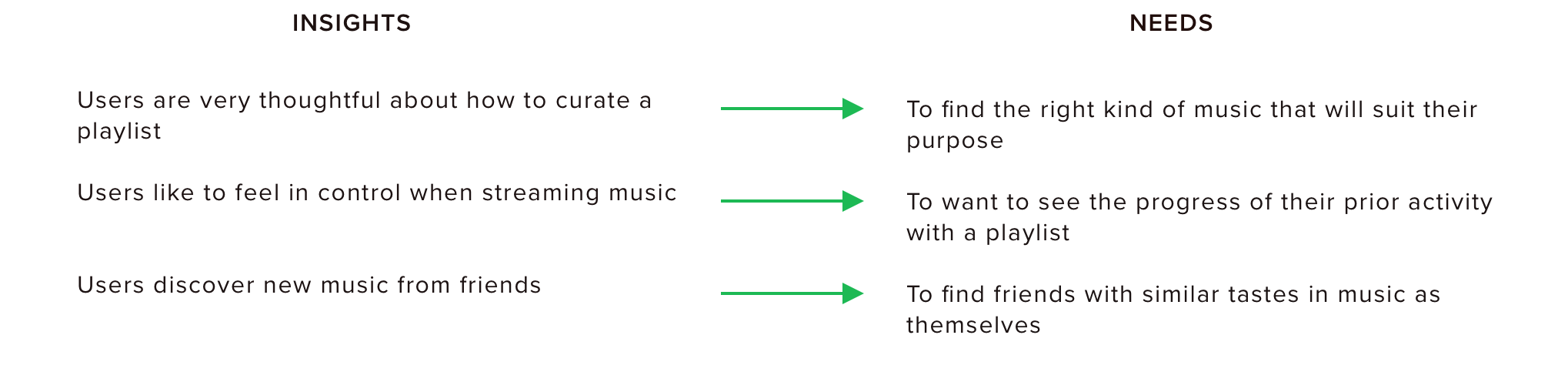
Unplanned goal
Spotify wanted me to focus on incorporating new social features but based on my user interviews, the 2nd need (user wanting to see his prior activity with a playlist) wasn’t ‘social’ in the true sense. But as I contemplated further, the original goal of Spotify is to increase user retention within the app and by addressing this need, I will be doing just that. So after getting approval from my mentor, I proceeded with this in addition to 2 other social features.
USER PERSONA
From my research findings and empathy map, I created a fictional user persona ‘Alex’ representing the characteristics/behavior of the key users that will allow for greater empathy and help me design relevant solutions, all while keeping focus on Spotify’s core users.
POV STATEMENTS + HMW QUESTIONS
Having defined the target user, I crafted the point-of-view (POV) statements framing the user's needs. These statements helped inform our "How Might We" (HMW) questions by better defining the right user problems I would need to solve for through my design.
IDEATE
GROUP BRAINSTORMING
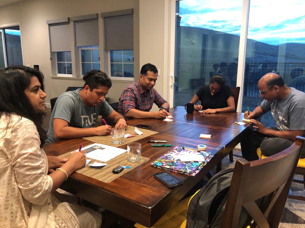
With Spotify been such a well established app, I want to find as many possible solutions as I could to select from. So in addition to brainstorming on my own, I conducted a group brainstorming with my friends who were Spotify users, after all 'more heads are better than one’. I adopted the Rapid Ideation technique and emphasized quantity over quality and no judgements as I facilitated the session.
PRODUCT ROADMAP
I derived the features that I thought would solve Alex’s problems and assigned priorities to each based on the value these solutions would provide, ease of implementation and how well they would integrate within the existing app.
APPMAP
With the new features selected, I then created an app map to determine where to place each feature. I referenced the app audit from earlier to ensure any new navigation would be intuitive to users.
USER FLOW
In order to better understand the various ways users could potentially navigate and discover the new features, I mapped out 3 user flows with our persona, Alex, referring back to the information I gathered from the user interviews during research. Breaking down each flow into sequential steps helped inform the relationship each screen and new feature should have and how to best optimize discoverability for each.
TASK FLOW
Next, I focused on further expanding each flow to identify the specific steps a user would take to complete the task and to understand how to prioritize content.
PROTOTYPE
SKETCHES
Before moving into digitally sketching wireframes, I sketched out potential ideas for the design and placement of the new features. I took inspiration from the existing new UI elements and the interface to ensure a seamless integration and leverage user’s familiarity with the current product.
BRAND STYLE TILE
For the success of these features, the new features introduced should be cohesive with the current app and the flow. And this can be achieved by familiarizing myself with Spotify’s branding guidelines. I also created a mood board after which I put together a style tile for referencing later.
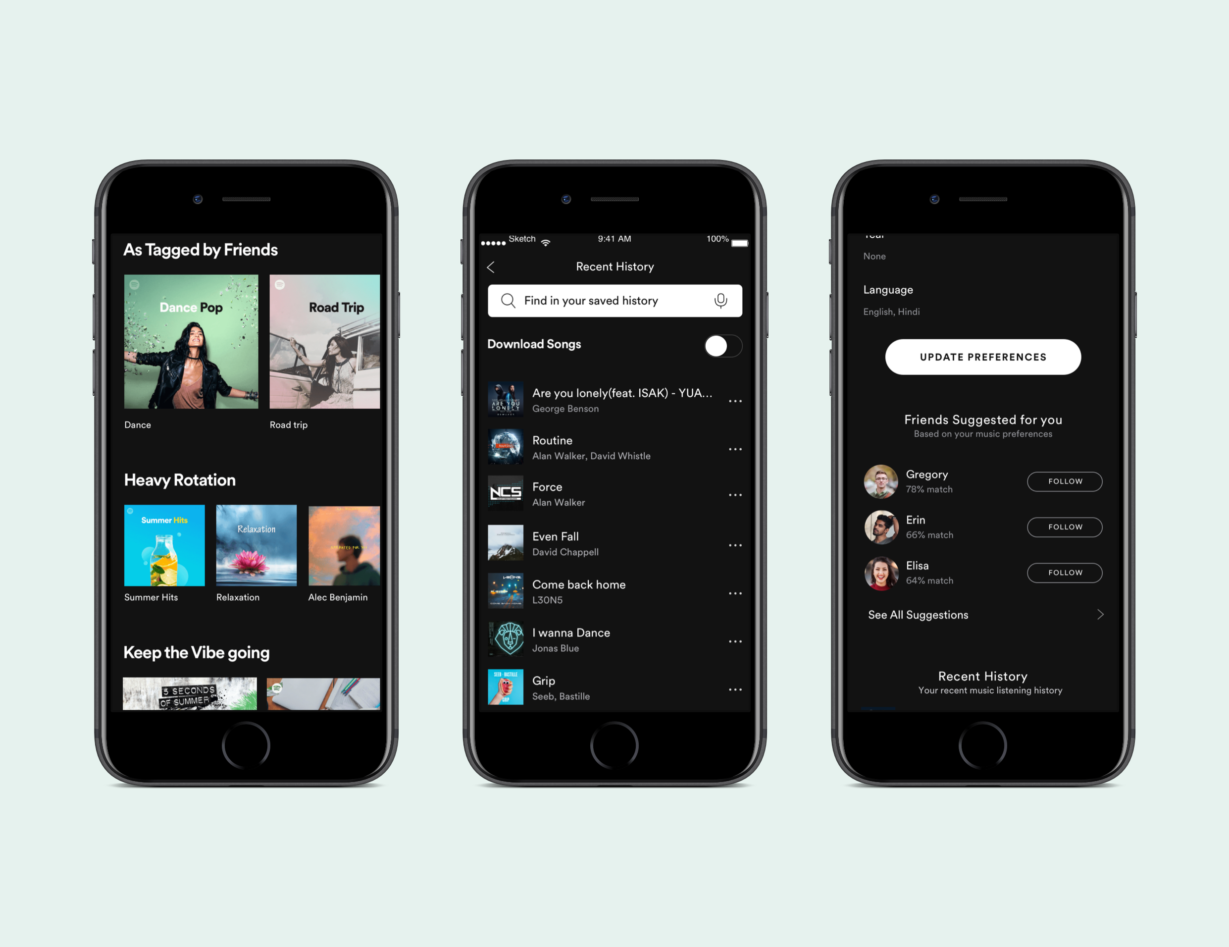
HIGH FIDELITY WIREFRAMES
I then moved onto crafting these high-fidelity wireframes in Sketch based on Spotify’s existing mobile UI. Prior to this, I incorporated changes to my sketches based on feedback from my mentor, namely replacing the “rating” feature. I skipped creating any mid-fidelity wireframes mainly since users are so familiar with the existing UI for Spotify that the absence of it would confuse them as they need to imagine a lot and this will hinder the effectiveness of the usability testing.
Following this, I created an interactive prototype using Marvel which will help in evaluating the usability of the product design and gather feedback.
Showing the modified and new screens below.
TEST
USABILITY TESTING
Method : Moderated
No.of participants - 5
Age group - 25 - 35
Gender - Male & Female
I created a test plan with the methodologies and specific tasks which I will have the users perform in the test. I expected a completion rate of 100% and 75% error free rate. I hit some neighboring coffee shops and recruited 5 Spotify users to test my prototype.
Objectives
Test if users can accomplish tasks successfully
Determine the overall usability of the app
Identify areas of inconsistencies
Tasks
Find your music preferences that you set up previously and follow the friend with best match
Enable making your music preferences public/shareable
Search for a song from a road trip playlist and and tag it
Navigate to the playlists feed recommended based on the tag you set, and play the songs
Navigate to ‘Your Recent History’
Select for the song ‘Come back home’ and share
AFFINITY MAP
I generated the Affinity map to present the synthesized findings of the usability tests in a visual report format, with insights and recommendations that will the help to iterate and improve the product. Contrary to my expectation, only 50% participants completed the tasks with no errors. However, the completion rate was 100%.
View the full Affinity Map here
REVISED HIGH FIDELITY WIREFRAMES + PROTOTYPE
I incorporated my affinity map findings/recommendations into my wireframes and redid the prototype using Marvel.
Interact with the prototype below.
UI KIT
As a final step, I updated the UI Kit that I had started putting together while building the high fidelity wireframes. This kit will contain all the UI elements used and will serve as a reference guide for any future work and will be handed over to the developer.
REFLECTION
Improving an existing product, especially such a mature and sophisticated product like Spotify, requires a complete different approach compared to creating a new product and more closer to projects in the real world. I was apprehensive initially about finding any new usable feature but the User interviews I conducted in the research phase gave me some delightful insights and I was able to use them as the basis to define the right problem and design possible solutions.
Few other things -
When feasible, I would like to collaborate and conduct or facilitate group brainstorming as the plethora of ideas generated in this session validated my own ideas and helped me refine them further. In addition, I was able to use my past experience as a team lead to conduct and facilitate discussions.
By adhering firmly to the existing branding guidelines, I was able to integrate the new features in such a seamless manner that users felt they were using the actual Spotify app. This emphasizes the criticality of adhering to the brand’s guidelines by us, Designers.
Initially the solution for 1 of the user’s need to have more control over his playlists didn’t seem to be a social feature but as I developed it further, I noticed that in addition to addressing the user’s frustration, it also helps in reducing the friction in Sharing with friends.
NEXT STEPS
Handoff final mockups to developers and collaborate with them to identify any technical limitations
Monitor engagement levels when feature is live
Conduct further usability testing with hi-fidelity prototype, collect usability findings and iterate